Using space to affecting meaning in models without connections
In two-dimensional art, once we have the marks we’re intending to communicate, we generally start focusing on forms. Forms are powerful in and of themselves. Logos, especially, tend to use only form and color to make meaning — any additional nuance or too-fine details becomes noise at best. A good logo is incredibly meaningful all by itself, and so can a set of nodes set on a page with intentional juxtaposition and placement.
When we start modeling information, we don’t necessarily require the use of connections right away. We might even deliberately put off documenting connections to deepen discussions and uncover more nuance. Some models can be truly complex before they ever get to the point of interaction with outside data.
While we’re in an unconnected state, especially, the juxtaposition and placement of nodes in reference to each other is meaningful.
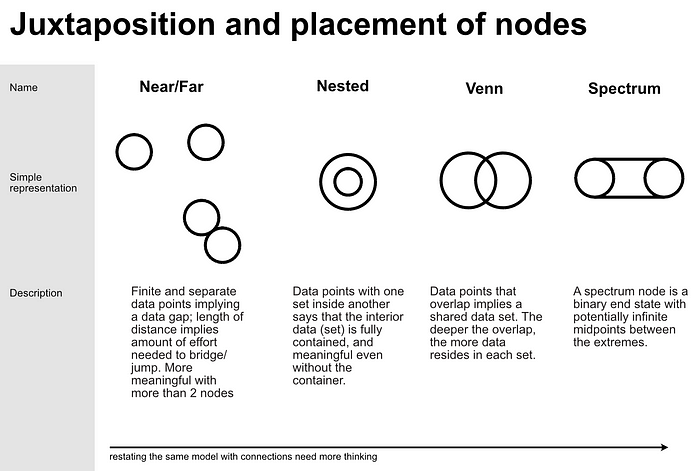
Near / far
The first factor is near/far. Nodes held far away from one another imply that the data is less likely to interact; this, by the way, has more meaning as more nodes are involved. Each node is considered finite and separate, with more space implying that there is more of a gap between the information. Conversely, the closer together the nodes are implies a higher chance of data interaction — less of a gap to bridge or jump. Sometimes distance will also help people focus on particular data in a model while calming the urgency to get it written down to help memory; in other words, it might only be distant for part of the discussion.

Nested
When one data set completely encompasses, but is broader than, another data set, we see a nested configuration. Another way to see it is that one data set got so close it was gobbled up whole by another data set. It also says that the data set in the interior nest is meaningful even without the exterior part of the nest.

Venn
When nearness overlaps, forming a Venn diagram, it means data is shared while the sets remain fully independent. The deeper the overlap, the more data resides in the involved sets.

Spectrum nodes
One of my personal favorites is the spectrum node. It’s a binary end state with potentially infinite midpoints between the extremes.

It’s not a common-use concept, and it generally is something that I pull in as the information becomes more complex and before we pull it back into simplicity; I always have to explain it. BUT I love it because of it’s inclusivity. It’s an implicit reminder that there might be more midpoints: undocumented, unnoticed, or not yet created. It also reminds us as we’re labeling that there is an extreme binary to the node, and to be careful that we’re not making implicit definitions of wrong/right, positive/negative, etc.
Binaries are rarely truly binary. We do not have only pitch black or blinding light, utter quiet or deafening volume. This type of node helps us remember to keep our minds open, and it makes the most sense when we’re thinking about information in terms of juxtaposition and placement.
All together now:
This is one pieces of Why learn the fundamentals of information architecture structures?
